
“The lead to a story is critical. A design has to make me stop, but I’m not going to stay unless the story reads well,” Betsy Rau said. “So often photo makes your design. I would say the two biggest elements of a good front page are typography and photo. The visual elements have to make them stop.”
Rau would know all about making them stop. She and her friend Cheryl Pell pick out newspaper designs that incorporate creative elements and cutting-edge design as part of what they call the Dueling Design Divas presentation.
But what makes a design? Sure, maybe a huge picture of your favorite band would do it, but what about drawing in everyone?
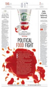
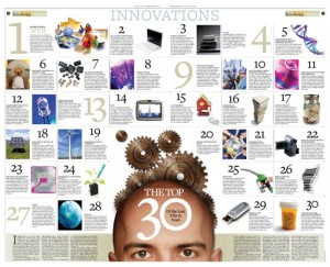
“You need something like a dominant, it could be type or a photo, but something has to pull me in, like the ketchup splatter,” Rau said. “That’s why I wanted the head on the innovations page to be bigger. I need that dominant.”
Professional news outlets often have a wider scope than a school paper does, which means that a lot of the cool ideas seen in the presentation might not apply verbatim.
“You obviously might not be able to do superman ripping open the paper, but maybe a football player running through it,” Rau said. “You have to take the skills involved in the pages we showed you and figure out a way to apply the general theme. Use it as a stepping stone. You need to get creative.”
Unfortunately, these days print magazines are falling more and more by the wayside. Web platforms are becoming ever more popular.
“All the things in the PowerPoint can be applied to a web platform,” Rau said. “Headlines are critical, and the tease ’em tell ’em strategy is a good idea for shorter stories. You still need good photos, and a big element in your designs.”
Journalism is a colosseum full of competition, so getting notoriety is imperative if you want to survive as a paper.
“You need to think like the reader,” Rau said. “Tell me something I don’t know. You have to pull me in, but an article is ultimately only as good as its content. You have to find a new angle, a new way to report and display what’s happening. That’s how you draw the reader in and keep them there.”
Betsy and Cheryl’s websites worth bookmarking:

Well, I think Meg did a good job of capturing what I think about design and storytelling. But why the heck feature Cheryl’s ketchup page? Ok. She beat me on that one. Thanks, Meg.